However, when I looked at the room with a critical eye, I had to admit the once-classic-beauty had the design-equivalent of drooping eyelids and a sagging jaw line. Now mind you, I did not want to spend the price of a real facelift :). I just wanted to tweak the room without breaking the bank. How much would it take to refresh the lady?
Ferreting ideas from Pinterest and Houzz, I embraced the makeover maxim: subtraction before addition. First, off came the peeling wallpaper. Although I loved the paper when we built the home, the surfaces had steamed for twenty years producing a not-so-youthful glow.
 |
| Beige and mint wallpaper was definitely over-the-hill. |
Next, I studied the room's bones and realized that, whereas youth is streamlined, this lady was--well, shall we delicately say--embellished. Soffits above the double sinks and cabinetry around the mirrors crowded the space.
Away they went.
A new face emerged.
Losing the excess was so freeing, we also eliminated the upper door of the corner cupboard.
Ah, less is more!
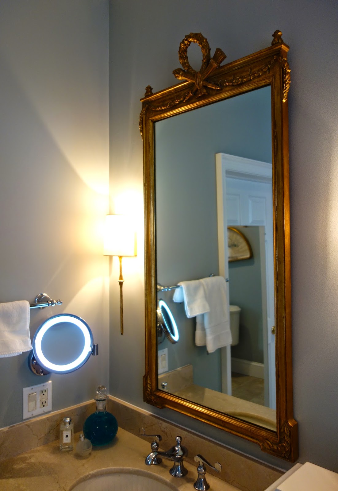
With the nips & tucks behind us, we were ready to contour a youthful vibe. I had the walls painted a Benjamin Moore Color Stories selection called "picnic basket", purchased a pair of gilded mirrors from the 1940s, and lighted the vanity with three Circa sconces.
 |
The old embroidered cafe curtains were country, not cool.
I replaced them with sleek Roman shades.
 |
| (Drapes made by Pat Martin of Going Home Interiors.) |
onto a contemporary dhurrie rug.
I love how the fleur-de-lis rug pattern acknowledges the Napoleonic motif on top of the mirrors.
Finally, I splurged on a lighted makeup mirror (since I am not getting any younger myself)...
and a new shower head for my husband.
Actually, the master-bath face lift didn't break the bank. We kept our flooring and countertops and didn't move or replace any plumbing fixtures. Yet, I think you'd agree, she looks years younger!


0 comments :
Post a Comment